Creating Pie Charts Based on Report Data
![]() .
.
Using Accolade online report data, users with All Reporting Rights can create charts on the Charts & Reports page. Administrators and Process Designers can set charts as available for sharing with other users, and can add a chart to a pod within a layout to display on a project page or as a global link.
Important! Select numeric data types for the Slice Represents values to render a meaningful chart. The system will not prevent you from selecting different data types and will plot selected data as best as possible without error.
To create a pie chart based on report data:
- From the Workspace menu, select Charts & Reports.
To narrow the list, search by the chart name or category.
Note: Process Designers can also create or edit charts, reports, and related configuration by navigating to the System menu and selecting Content Sources > Charts & Reports Manager.
- Do one of the following:
- To add a new chart - Click Add New, select Chart from the drop-down list, and click the Pie Chart
 icon.
icon. - To edit the details of an existing report - Click the name of the chart on the Charts & Reports page and click
 to edit the report details. Only users assigned as chart owners and Process Designers with All Reporting Rights can edit chart details.
- Enter the following information to identify the chart:
Required fields display with red text and an asterisk * if the field is empty.
|
Field |
Description |
|---|---|
|
Name |
Enter a name, up to 64 characters long, which identifies the chart. To display this name as the chart's title, select the Display as title option. |
|
System Name |
Enter a unique, shorter name that identifies the chart in queries, reporting views, field codes, and other places in Accolade. The name must be unique among charts and can contain only letters (English alphabet), numbers, and the underscore. |
|
Category |
Enter or select the group to which this chart belongs. More... Use categories to organize like charts together. For example, you may choose to group all the charts used in global layouts into the same category, in order to separate them from charts that are used in process model layouts or other reporting.
|
|
Description |
Enter a description of the purpose or nature of the chart. This description helps other users identify the chart on the Charts & Reports page. |
|
Owners |
Click To filter the list of users, enter one or more search criteria to filter by name, login name, email address, function, or extended field. More...
An assigned owner with All Reporting Rights can view, update, delete, or add additional owners to the chart. An assigned owner who has Refresh Workbook Data rights will only be able to view the chart. To make the chart available for all users or for configuration setup, you must have a Process Designer with All Reporting Rights as an assigned owner. |
-
(All optional, available in configuration only) Enter the following information to make the chart publicly available. More...
Field
Description
Available to Charts & Reports
Select this check box to make the chart publicly available for users to access and view the chart.
Users with one or more matching user roles and either Refresh Workbook Data or All Reporting Rights will be able to view the chart in the Shared Charts & Reports section on the Charts & Reports page.
Available to Configuration
Select this check box to make the chart available for use in configuration.
Specific Roles
Select the system user roles that have access to view the chart.
Users with one or more matching user roles and either Refresh Workbook Data or All Reporting Rights will be able to view the chart on the Charts & Reports page.
Configuration Access Groups
When either Available to check box is checked, access groups must be defined for the chart.
The access groups displayed are based on the current user's access group permissions and the access groups the chart belongs to. Additionally, Process Designers with matching permissions will be able to edit and view the chart.
Process Model Usage
(Available for existing charts) Click on the Process Model Usage button to see a list of process models that the online chart is associated with.
The list displayed includes all process models the chart is included in, as well as links to the process model's component tree pages you have Edit access to.
Note: Clicking either Available to check box will place the chart in the Shared Charts & Reports section of the Charts & Reports page. If neither check box is selected, the chart will only be available to the assigned owners in their My Charts & Reports section.
- In the Report Source field, select the report that contains the data to include in the chart. Only online reports created in Accolade are available for selection.
- Select the following information to define the slices within the pie chart and how they display:
|
Field |
Description |
|---|---|
|
Slice Represents |
Select the data column that contains the row items that the slices in the pie represent. |
|
Slice Size |
Select the numeric data column that determines the size of the slices in the pie. |
| Cycles |
Select one or many cycles. Each cycle is a data column that contains the row items that the slices in the pie represent. The Slice Represents selection is automatically selected and cannot be unselected. |
|
Slice Name |
Select to include the name of the pie slice as part of the slice's label. |
|
Slice Value or Slice Percentage |
Select whether to label the pie slices by value or percentage of the pie included in the slice. You can select one or both, or select neither to display the slices with no values. |
- Select the following attributes to define the pie chart's style:
|
Field |
Description |
|---|---|
|
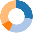
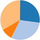
Doughnut |
Displays the pie with an empty space in the middle.
|
|
Exploded |
Displays the pie with space between each piece.
|
|
Number Format |
Select a number formatting option to indicate how the values in the chart are displayed. |
|
Color Theme |
Select the color palette to assign to the pie sections of the chart. If plotting 10 or more data points, consider a color theme to accommodate each value measurement. Themes 2-5 allow for up to 20-25 plotted values. |
|
Legend |
Select where in the chart to display the key that identifies what the colors in the chart represent. After the chart renders, toggle a key label in the legend to hide and show data without changing the underlying chart and report configuration. |
- (Optional) If you edited an existing chart, click
 in the upper right corner to view the new chart.
 - Click Save to save your changes and create the chart.
Example - Creating Pie Charts in Accolade
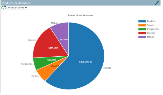
For example, a user wants to review and compare the revenue by region for a portfolio of products over the last several years. The user has created a Product Line Revenues Report for their report source, and selected the Product Lines, Region, Year, and Revenue metrics to be included in the report.
For example, a user wants to review and compare last year's sales revenue numbers for several projects. The user has created a Sales Performance report for their chart report source, and selected the Project Name and Sales Year 1 metrics to be included in the report.
To create a pie bar chart to display this information and cycle through the metrics for different chart views, the user has selected the Product Lines for the Slice Represents, the Revenue for the Slice Size, and the Region, Year, and Revenue as the Cycles values. The Product Lines in the report represent the business units of Desktop, Tablets, Peripherals, Servers, and Mobile. The slices represent the various products by category across region and revenue over several years. Select the cycle icon ![]() to view the different charts. Toggle a key label in the legend to hide and show data in the rendered chart.
to view the different charts. Toggle a key label in the legend to hide and show data in the rendered chart.
To create a pie chart to display this information, the user has selected Project Name as the Slice Represents value, and Sales Year 1 as the Slice Size value, to create slices that represent each project's sales revenue as a portion of the company's overall sales total.

|
Notes:
|
- Adding Target Lines to Bar Charts
- Creating Bar Charts Based on Report Data
- Creating Bubble Charts Based on Report Data
- Creating Grouped Bar Charts Based on Report Data
- Creating Line Chart by Columns Charts Based on Report Data
- Creating Line Chart Trends Charts Based on Report Data
- Creating Pie Charts Based on Report Data
- Creating Radar Charts Based on Report Data
- Creating Stacked Bar Charts Based on Report Data
- Importing and Exporting Accolade Charts
 and select the additional users who can edit the chart details.
