Comparison View Example
Administrators and Process Designers with the Template Access user role can design custom page layouts, such as a project dashboard page that displays when opening a project, that allows user to view and compare project data from current, scenario, and/or snapshot data sources. Comparison view layouts can contain one or more pods to display charts, reports, or planning views from these sources, and can be associated with a process model for display within a project or portfolio, or added as a global link within Accolade.
Example Scenario
Consider this scenario: a portfolio manager wants to be able to review financial data for his portfolio, and wants to compare the current data against the same data captured in a snapshot taken at the end of the last fiscal year. In this view, the manager wants to be able to see a report with the individual data values, as well as a chart visualization of the information.
The following sections provide details on the setup for this scenario, as well as some common variations.
Preparation: Create the charts, reports, and planning views for use in the comparison view.
Before building the comparison view layout, the Process Designer starts with creating the charts, reports, and planning views to be used in the configuration of the report group pods. In this example, the projects being analyzed contain metrics that represent quarterly sales figures that will be represented in the configured charts, reports, and planning views.
For the comparison view data sources, the Process Designer has created the following:
- a report called Live Data Report that contains the financial data from the current projects, and a related chart called Live Data Chart that uses the live report as the source, and is a visualization of the current project financial data.
- a report called Snapshot Data Report that contains the corresponding financial data from last year's snapshot, and a related chart called Snapshot Data Chart that uses the snapshot report as the source and is a visualization of the snapshot project financial data.
Step 1: Create a page layout that contains a comparison pod set.
For the initial layout creation, the Process Designer starts with creating the layouts and adding the appropriate layout settings as described in Creating Page Layouts.
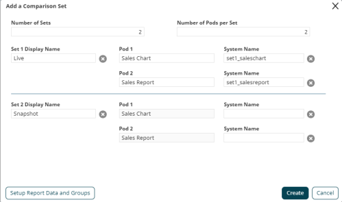
To add the comparison pod set, the Process Designer makes the following selections in the Add a Comparison Set dialog:
- Number of Sets - The number of sets would be 2, since the portfolio manager wants to be able to compare data from two different sources - the live data, and the snapshot data.
- Number of Pods per Set - The number of pods per set would be 2, since the portfolio manager wants to view the report data and chart visualization for each source.
- Set 1 and Set 2 Display Name - The set display names are used to identify the sets/pods combinations when the report groups are selected for display. In this example, they are generically named Live and Snapshot.
- Pod 1 and Pod 2 names and system names - These are named Sales Chart and Sales Report (with corresponding system names), to represent the type of content that will be displayed in the pod within the layout.

Step 2: Configure the Report Pod settings.
Since the comparison view includes multiple data sources - the live data, and the snapshot data - the view will need to have 2 corresponding report groups defined for the content displayed.
It may be helpful to think of the report groups with regards to their relationships to the data source. For this example, one relationship is "Live Data", to include the live data report and the live data chart created above, but could also include any other reports/charts/planning views that are relevant to this dataset. The second relationship is "Snapshot Data", to include the corresponding snapshot data report and chart created above (as well as any additional reports, charts, or planning views). You could create a third option "Snapshot (Year XX) Data", that could include a different snapshot data report (such as one taken on a different date), and create related charts, and so forth. What is important is that they have comparable metrics - for example, "metric A" should have a value in each category - so they can be compared across the view.
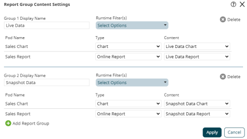
To define the report groups available to the comparison view, the Process Designer makes the following selections in the Report Group Content Settings dialog:
For the first report group:
- Display Name - This is defined as Live Data, to indicate that this group will display current project financial data.
- Runtime Filters - This example does not include run time filters, so no options are selected. See the example variations section below for more details.
- For the Sales Chart pod, the Type is defined as Chart, and the Content is defined as the Live Data Chart created above.
- For the Sales Report pod, the Type is defined as Report, and the Content is defined as the Live Data Report created above.
For the second report group:
- Display Name - This is defined as Snapshot Data, to indicate that this group will display snapshot project financial data.
- Runtime Filters - This example does not include run time filters, so no options are selected. See the example variations section below for more details.
- For the Sales Chart pod, the Type is defined as Chart, and the Content is defined as the Snapshot Data Chart created above.
- For the Sales Report pod, the Type is defined as Report, and the Content is defined as the Snapshot Data Report created above.

Step 3: Associate the layout with a process model or add the layout as a global link.
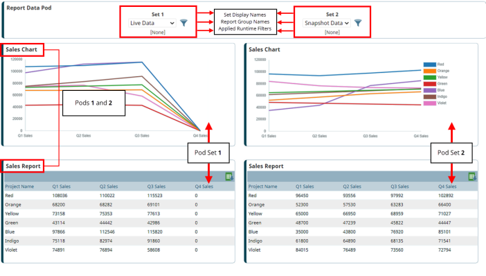
In this scenario, the portfolio manager wants to review the financial data for his portfolio of projects, so the layout will be added to the portfolio project process model and displays as a page within the project as follows:

Example Variations
Using the same scenario above, here are some common variations to the comparison view layout setup.
Adding Runtime Filters to a View
Runtime filters allow the user to apply filters to the data when it is displayed. These filter options must be enabled BOTH on the report source (regardless of whether the report is displayed in the layout) AND enabled in the Report Group Content Settings dialog in order to be available for users.
The filter icon will not appear in a layout's charts or reports pods if there are no filters available for users to apply to the contents.
For this scenario, the Process Designer adds the following additional steps:
- In the Preparation section, the Region metric is added as a Selected Filters option for both the Live Data Report and Snapshot Data Report reports, and the Runtime Filter check box is selected to allow users to apply this filter to the report (as well as any charts that use this report as a source) when they are displayed in a layout.
- In the Configure the Report Pod settings section, the Region metric is selected as a Runtime Filters option for both the Live Data and Snapshot Data report groups.
Using Multiple Pods, Pod Sets, and/or Report Groups
Layouts can only contain one comparison set, but can contain multiple pods, pod sets and/or report group sources. Some alternate configuration options might include the following:
-
Configuration of 3 pod sets, to compare data from a live source with different sets of snapshot data within the same view. More...
For this variation, the Process Designer adds the following steps:
- In the Preparation section, a report and chart would need to be created for use in the additional snapshot report group setup.
- In the Create a page layout that contains a comparison pod set section, the Number of Sets value would be increased to 3 and the set information added for the additional pod set.
- In the Configure the Report Pod settings section, a third report group would be added for the additional snapshot's report and chart.
-
Configuration of pods with only charts for comparison, for example viewing a chart with sales and a chart with operating costs for comparison. More...
Note that this also applies to configuration of pods with only reports for comparison.
For this variation, the Process Designer adds the following steps:
- In the Preparation section, the reports would need to be expanded to include all data to be displayed in the view, and individual charts would need to be created to visualize the relevant data.
- In the Create a page layout that contains a comparison pod set section, the pod display names would be updated to reflect the data being displayed.
- In the Configure the Report Pod settings section, the Type for each pod would be defined as Chart, and the Content defined as the chart to be displayed within the corresponding pod.
-
Configuration of multiple report group sources without creating new pod sets, for example to allow users to select from multiple report group sources without expanding the layout display. More...
For this variation, the Process Designer adds the following steps:
- In the Preparation section, a report and chart would need to be created for use in each additional report group setup.
- In the Configure the Report Pod settings section, each additional report group would be added with its respective report and chart.